Xiaoxue's portfolio
Wecareoo
Individual thesis project 2023
My Design is a plugin for Figma. It mainly focuses on helping designers to understand and apply energy-saving fonts, energy-saving color schemes, as well as providing aesthetically pleasing and feasible solutions for energy-saving treatment of images in the design process. It also conceptualizes the design and reading mode of future web pages from the design point of view. It also provides options for web browsing users.

Concept
When designers work on web design, they usually consider the aesthetics of the design, the ease of use, the user experience and so on. We always design from these perspectives, but hardly ever consider the energy consumption of web design.
As designers we don't have this awareness and lack of knowledge. But designers have this responsibility. Energy has to be taken into account in the future. With my design, I have just made up for the fact that designers have to think about energy. It's better to save energy than to constantly tell users that you have to use options like the Internet less. We can design web pages that are more low-carbon. So that users can have more choices for themselves.

Problem
Airbnb had over 300 million views between May and July this year alone. According to estimates Ecping.Earth's calculations show, then it produces carbon emissions that would take 50,0000 mature trees a year to absorb.
Obviously, in order for the Airbnb webpage to achieve zero emissions, it is totally unrealistic for us to go and plant 50, 0000 trees now. But if, however, we reduce its carbon emissions by designing an energy-efficient webpage, it will be much easier and will be immediately effective.
Interface design
If designer want web pages to be more energy efficient, using more system fonts is one means of reducing the energy consumption of your web pages. In the font design screen of the plugin, I have defined four levels for fonts as follows. The following four font energy levels have been designed to help designers recognise and use system fonts.

Fonts


Before

After
In traditional interfaces, designers understand the relationship between colors through the hue, purity and lightness of colors, or CMYK and RGB, we never get the relationship between colors from the energy point of view. Designers lack knowledge of the relationship between color and energy.
In my design interface, we will start from the connection between energy, and designers will get to know the relationship between colors and energy through the regulation of energy values.

Color

Before

After
The relationship between color and energy
The main reason for oled display to emit light is the combination of the three colours represented by the RGB lights, according to the data of the sustainable website, the energy ratio of the red, green and blue lights is 2:4:7, that is to say, its RGB energy relationship should be shown as the model on the right.


Now all the colors are divided into 100 parts according to the energy. The same energy level of the color distribution can be selected through Python processing, so that we can more clearly know its energy relationship. For example, let's programmatically derive all the colors with an energy between 70-70%. We have 219,831 colors.


10 % 37075

20 % 133688

30 % 229721

40 % 307676

50 % 308955

60 % 303596

70 % 219831

80 % 123410

90 % 30460
For the different energy levels of the colors, I intercepted some of them.
An energy relationship is obtained as follows.
Images are one of the biggest contributors to the amount of data transferred on most web pages, and my plugin provides designers with different means of manipulating images so that they can apply graphic effects according to aesthetics and needs. So that you can actually reduce the energy consumption of your web pages.

Graphic

Before

After

1 % of the original image

2.4 % of the original image
3 % of the original image

9 % of the original image

12 % of the original image

16 % of the original image

40 % of the original image

44 % of the original image
I have processed the image through tools like Illustrator / Photoshop and by exporting the image under the same conditions, I can realistically know how much energy is saved by that mode of image processing. The result is shown on the left.
User Interface
In a regular user interface, the user usually has no choice when browsing a web page, as a user can only choose to look and not to look. Users know that the Internet consumes very much energy, but are very dependent on it. This makes them very passive and have no choice when browsing the web.
The future of the web is first and foremost low energy priority, so my design provides the user with two switching modes from low energy to high energy. The user has a third choice between looking and not looking. The user is no longer the passive party.

Click the button to enter the high energy mode of this picture

Two switching mode buttons from low energy to high energy


Case Applications
With the following case study, we can design a new visual effect web design with the premise of low energy web design. The following three web pages are my attempts.
case 1
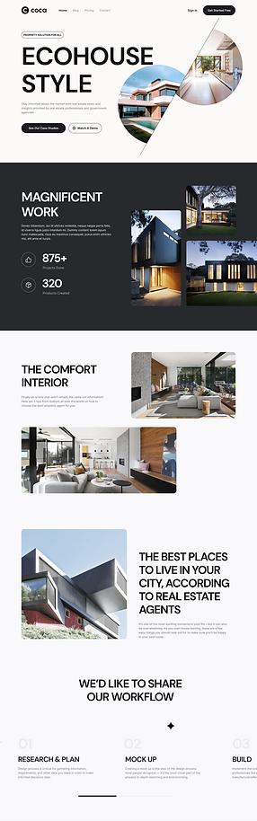
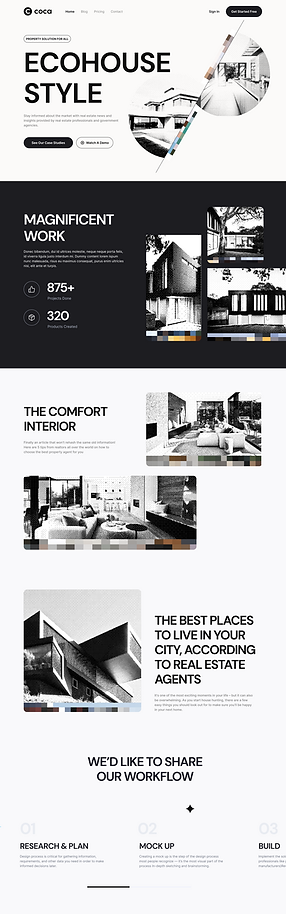
The image on the left is from the ECO HOUSE STYLE website, and by processing the image on the right, we have reduced the image to 3 % of its original size.
case 2


The image on the left is from the STYLE website, and by processing the image on the right, we have reduced the image to 12 % of its original size.
conclusion
Energy efficient design is not a compromise and does not mean a low visual experience. It can be equally beautiful. So on the road of exploring energy-efficient design, it seems to be one challenge after another, but in fact, it is one opportunity after another. What the future looks like is something we can have to decide for ourselves. If we desire a sustainable world, then we can create it.